UI/UX Case Study
Vendor + Ritual Rewards Gameplay Loop
View Full Presentation


Overview
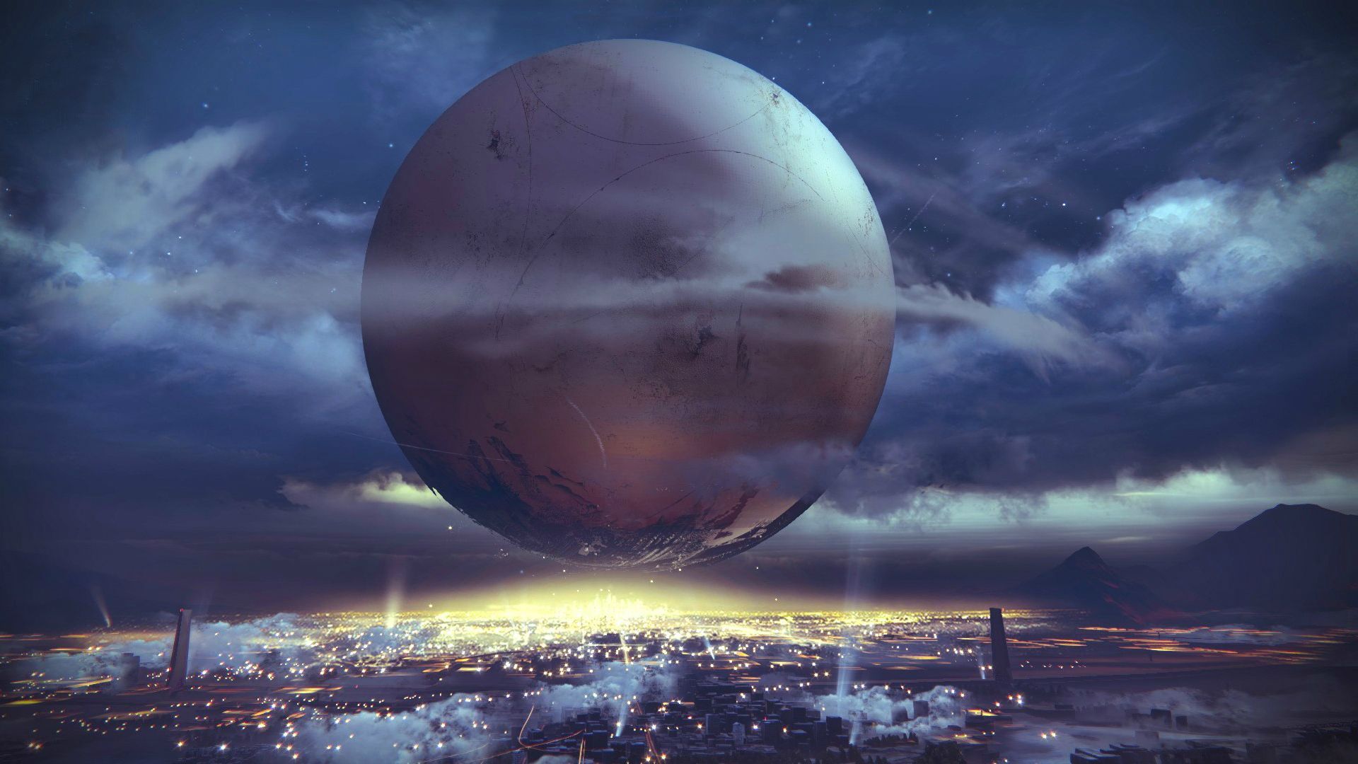
This project was an assignment to review the game flow of an existing game (Destiny 2) and look for opportunity areas for improvements. I centered my solutioning around the activity-to-rewards-activity gameplay loop.
Role
UI/UX Designer (Solo)
Purpose
ELVTR Coursework
Timeline
Two weeks (Part time)
Game
Destiny 2: Lightfall (Xbox)
Project Outline
Understanding the Challenge/Problem
This is a typical process I pursue in my role as a Senior UI/UX designer. During client kickoff, we try to gain alignment around these four crucial pillars before starting any solutioning or 'work'. In this project, I had to make some assumptions around the project challenges.
Mission, Goals, and Context
Destiny 2 is a 'looter shooter' MMO game with a unique "mythic sci-fi" twist. Players objectives are to explore and overcome increasingly challenging content while they earn loot.
The stakeholders are looking for help exploring solutions to improve business metrics, namely ARPDAU (average revenue per daily active user), as well as player experience and sentiment, without causing unnecessary technical burden.
Milestones and Deadlines
The stakeholders are looking for the first set of solution(s) targeting existing features to be submitted within two weeks, while the solution(s) targeting their new, unreleased features are due two weeks after that.
The entirety of all solutioning needs to be completed within one month.
Resources, Previous Work, and Tools
I'm using interfaceingames.com as a reference point for analogous solutions and inspiration. Some UI assets are available to help reduce technical burden.
There is no previous work available to me to access, minus what's available to view in the game today.
Risks and Watch-Outs
The primary risk is the wide-open scope, unknown technical constraints, and lack of visibility into true business metrics. Solutions I'll be proposing are sacrificial concepts and intended to be preliminary explorations rather than final, production-ready solutions.
Additionally, my time is restricted by the available hours I have in the evenings.
Current State Research

Playing the Game
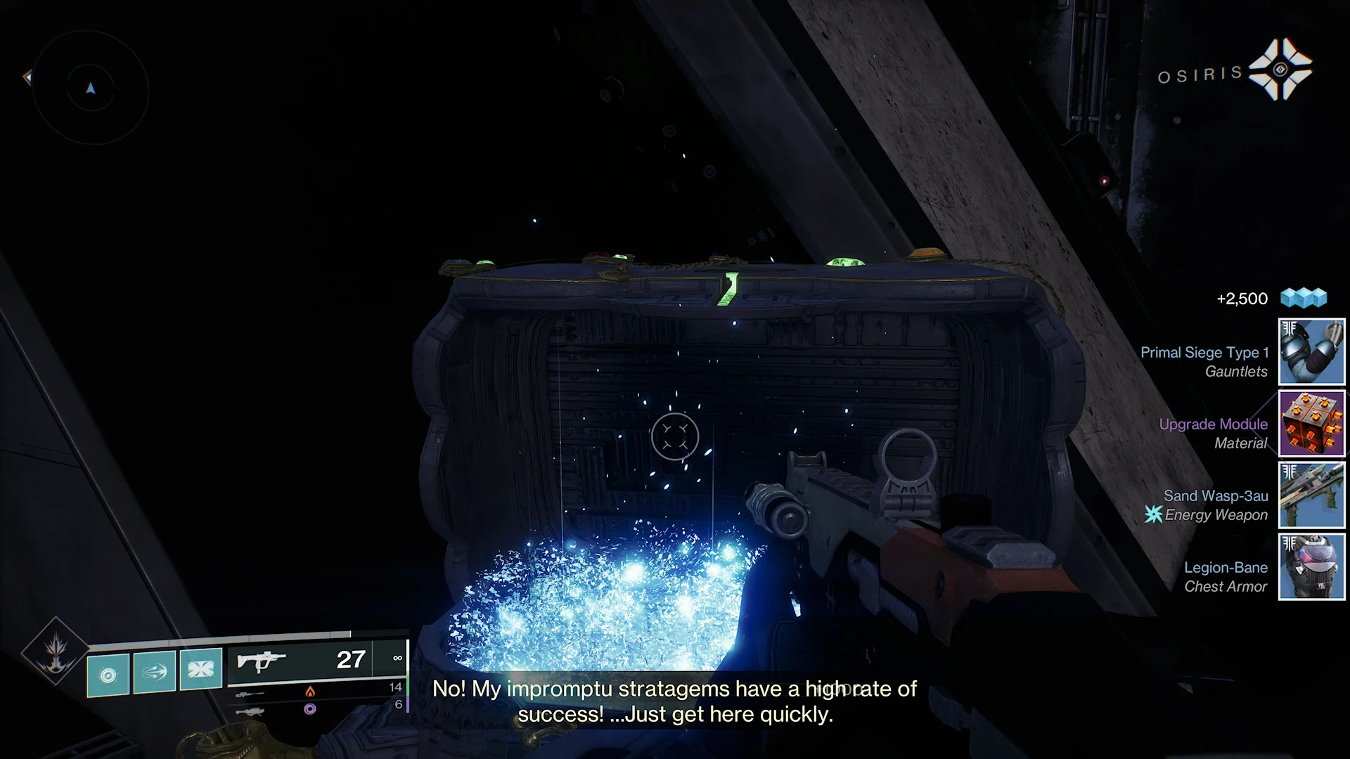
This part seems obvious, but I wanted to capture the experience of actually playing the game. I spent around 20-30 hours in the game before the end of the project, carefully poking around all corners of the game's menus, submenus, navigation, and user flow.
I'm screenshotting every piece of the game I see, and studying every state of the UI—looking for things like different system states, calls to action, and errors.

Diagramming and Documenting the Game Flow
Diagramming and Documenting the Game Flow
Once I began to understand the game flow, I created this basic diagram in Figjam so I can reference it later.
Once I began to understand the game flow, I created this basic diagram in Figjam so I can reference it later.

Simplifying the Game Flow Visualization
This portion I made just to make it easier to glance at during user flow diagramming later. It gave a very simplified reference for how each of the core elements of the game connect together.
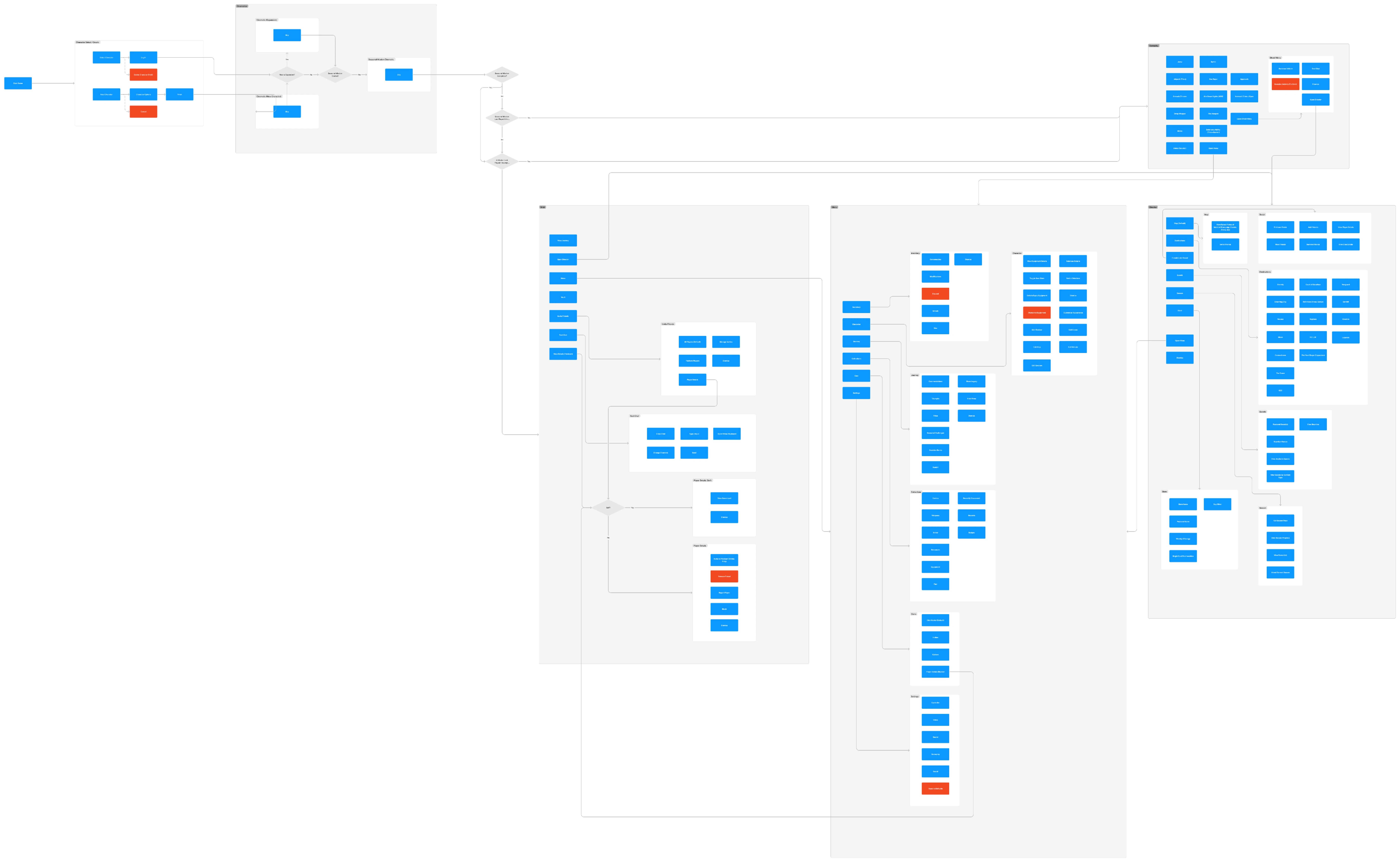
Creating Current-State User Flows
I built a system map of the entire game using user flow diagramming techniques. This gives me a great map to reference when I begin solutioning later on so I don't have to reference screenshots so often.
Current State Research

Playing the Game
This part seems obvious, but I wanted to capture the experience of actually playing the game. I spent around 20-30 hours in the game before the end of the project, carefully poking around all corners of the game's menus, submenus, navigation, and user flow.
I'm screenshotting every piece of the game I see, and studying every state of the UI—looking for things like different system states, calls to action, and errors.

Diagramming and Documenting the Game Flow
Once I began to understand the game flow, I created this basic diagram in Figjam so I can reference it later.

Simplifying the Game Flow Visualization
This portion I made just to make it easier to glance at during user flow diagramming later. It gave a very simplified reference for how each of the core elements of the game connect together.

Creating Current-State User Flows
I built a system map of the entire game using user flow diagramming techniques. This gives me a great map to reference when I begin solutioning later on so I don't have to reference screenshots so often.
Player Profiles + Journey
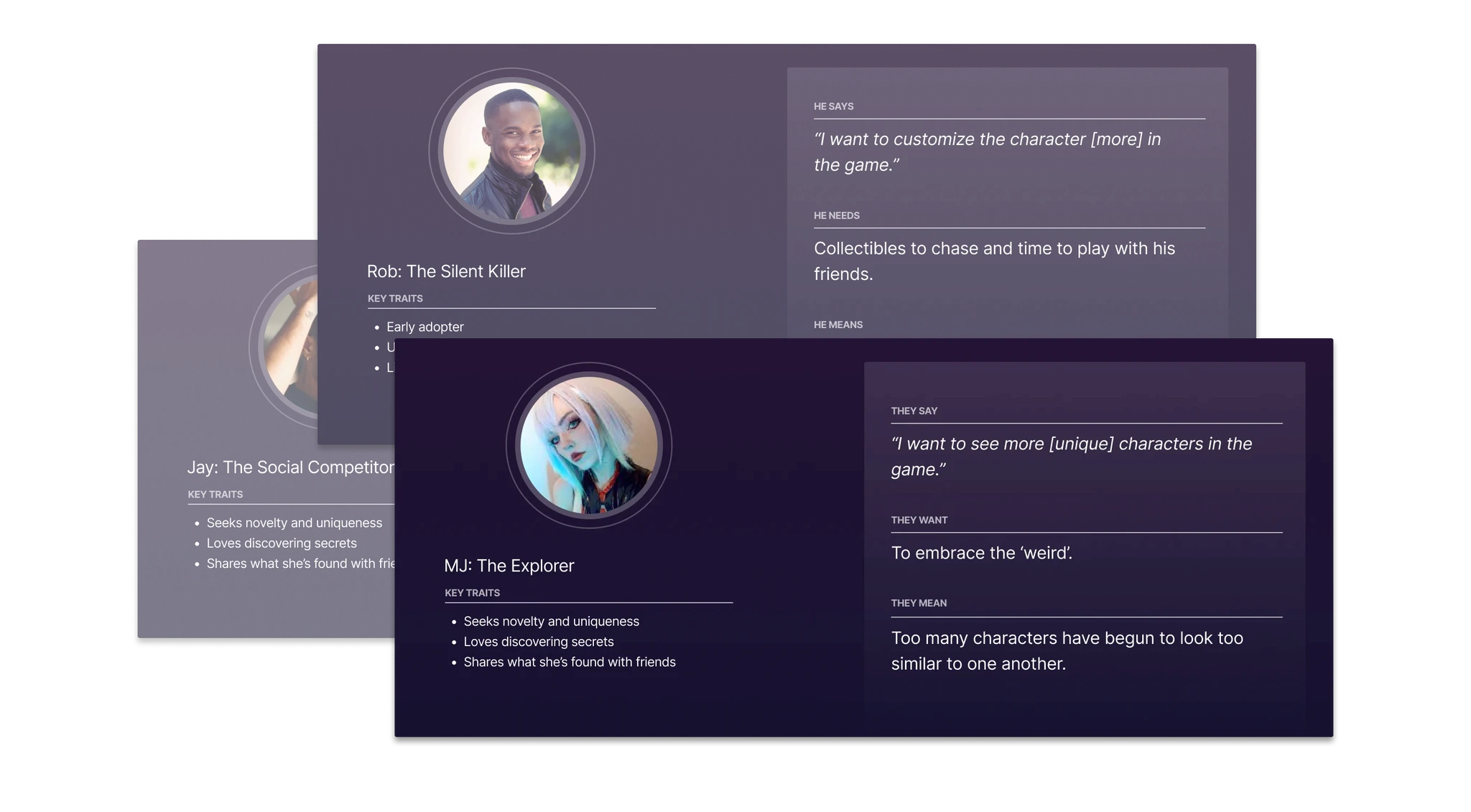

Who Are the Players?
I created some of these basic persona cards to help target solutions to the specific types of players that usually play the game. I'm using example data here, but in other projects I'd make amalgamations based on the data we have on the players and their qualitative traits (from user research).
What is their Journey?
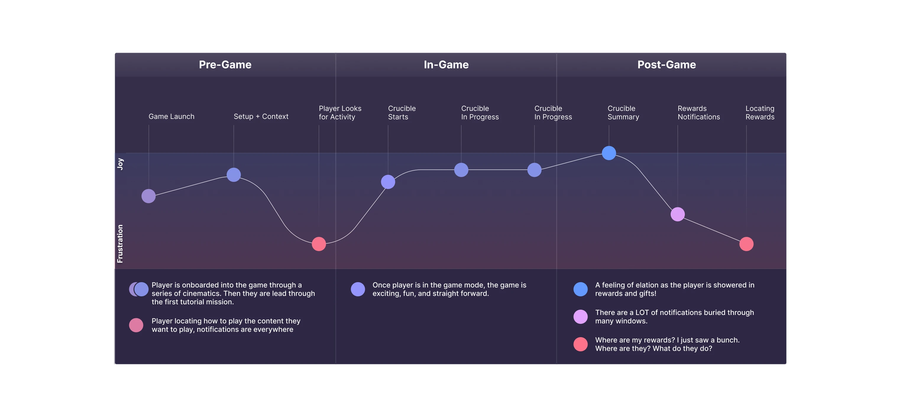
After reviewing the new player journey, I plotted some of the experiences on a simplified journey map to make it easier to communicate where the opportunity ideas are positioned within the gameflow.
Player Profiles + Journey

Who Are the Players?
I created some of these basic persona cards to help target solutions to the specific types of players that usually play the game. I'm using example data here, but in other projects I'd make amalgamations based on the data we have on the players and their qualitative traits (from user research).

What is their Journey?
After reviewing the new player journey, I plotted some of the experiences on a simplified journey map to make it easier to communicate where the opportunity ideas are positioned within the gameflow.
Defining Opportunities

Using Design Pillars
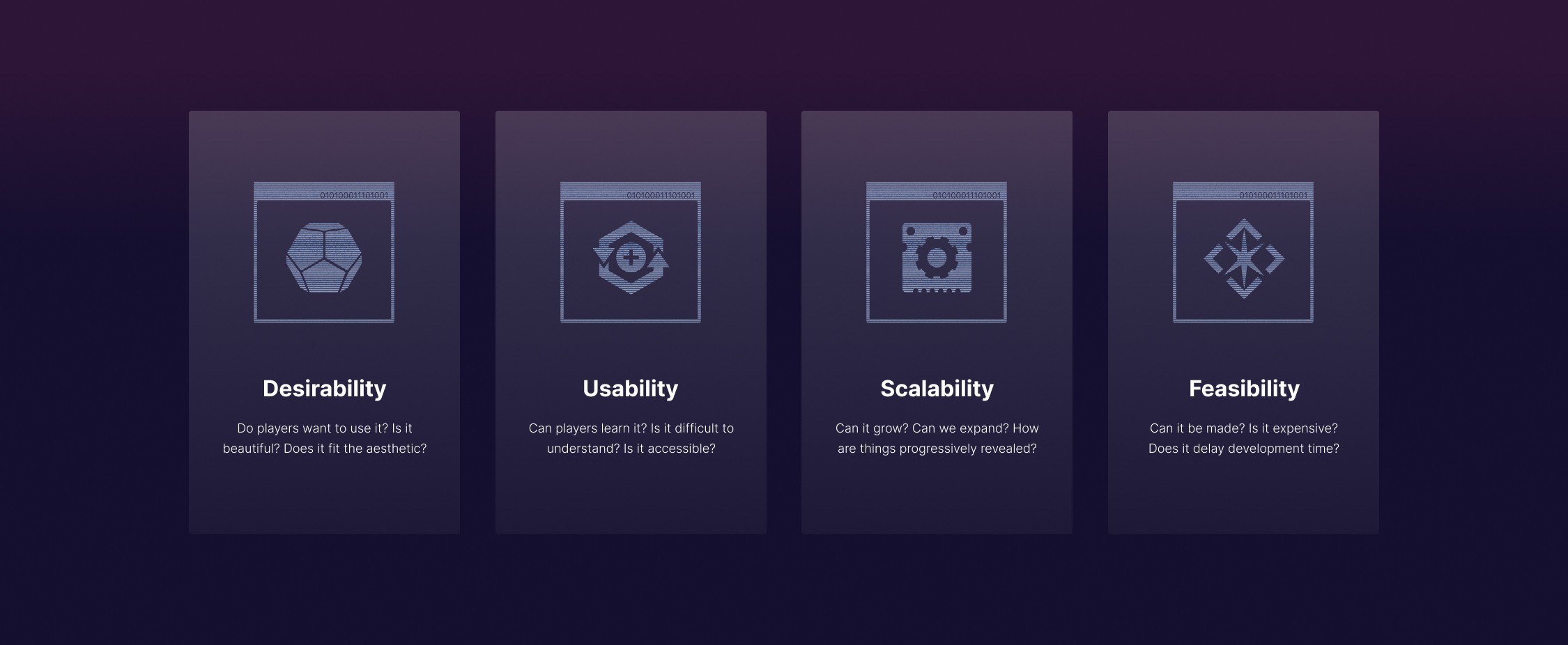
These are some of the high level, simplified pillars I'm using as I'm navigating through each screen.
Finding Areas of Focus
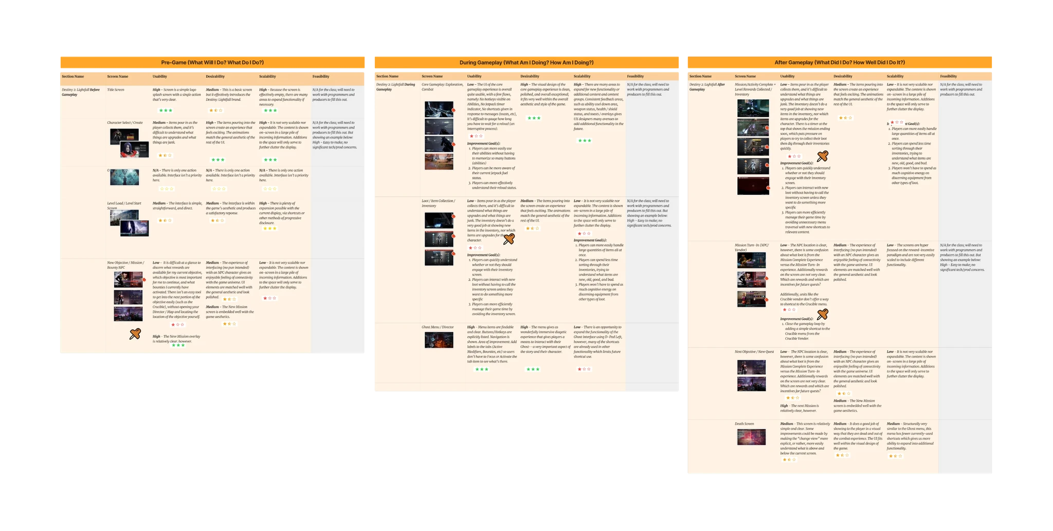
I compare each of the screens against the design pillars mentioned before, documenting how each piece of the experience either meets, exceeds, or under-performs.
I add red dots to screens that had the most opportunity for solutioning (based on feedback) and pins to the primary screens I want to focus on—experiences that I felt would have the largest impact to the player experience based on how big the pains were in the journey.

Defining Opportunities

Using Design Pillars
These are some of the high level, simplified pillars I'm using as I'm navigating through each screen.
Finding Areas of Focus
I compare each of the screens against the design pillars mentioned before, documenting how each piece of the experience either meets, exceeds, or under-performs.
I add red dots to screens that had the most opportunity for solutioning (based on feedback) and pins to the primary screens I want to focus on—experiences that I felt would have the largest impact to the player experience based on how big the pains were in the journey.

Rapid Prototyping
01
How might we…
Make it easier to locate and understand rewards?
02
How might we…
Make it easier to locate and play content players want to play?
03
How might we…
Make it easier to understand and manage notifications?
Reframing Pain Points into Opportunities
Using simple "how might we…" statements, I can reframe the problems users are having into opportunity spaces for ideation.
01
We can by…
Reworking vendor UI to be more centered on current rewards and progess.
02
We can by…
Adding contextual shortcuts in vendor menus to their respective activies.
03
We can by…
Ensure all menus with nested notifications have a "dismiss all" function.
Ideating Solutions to the Oppportunities
After rapid concepting, I had these three solutions remaining that I took into further refinement.


Paper Prototypes
At its simplest form, I use the paper prototypes as a very rough and scrappy way to think through the screens and flow for each idea.
Rapid Prototyping
01
How might we…
Make it easier to locate and understand rewards?
02
How might we…
Make it easier to locate and play content players want to play?
03
How might we…
Make it easier to understand and manage notifications?
Reframing Pain Points into Opportunities
Using simple "how might we…" statements, I can reframe the problems users are having into opportunity spaces for ideation.
01
We can by…
Reworking vendor UI to be more centered on current rewards and progess.
02
We can by…
Adding contextual shortcuts in vendor menus to their respective activies.
03
We can by…
Ensure all menus with nested notifications have a "dismiss all" function.
Ideating Solutions to the Oppportunities
After rapid concepting, I had these three solutions remaining that I took into further refinement.

Paper Prototypes
At its simplest form, I use the paper prototypes as a very rough and scrappy way to think through the screens and flow for each idea.
Task Flow and User Flow

Task Flow
I refine the paper prototype, and move it into a new task flow using the system map I made earlier as a guide. These are the 'happy path'; no choices, errors, or extraneous pathways are present.

User Flow
Once I was happy with the task flow and it makes sense with the total system map we made earlier (minus some suggest updates where it makes sense), I created a user flow, capturing the pieces of the experience that a player would touch on their way to achieve a goal (choices included!).
Task Flow and User Flow

Task Flow
I refine the paper prototype, and move it into a new task flow using the system map I made earlier as a guide. These are the 'happy path'; no choices, errors, or extraneous pathways are present.

User Flow
Once I was happy with the task flow and it makes sense with the total system map we made earlier (minus some suggest updates where it makes sense), I created a user flow, capturing the pieces of the experience that a player would touch on their way to achieve a goal (choices included!).
Wireframing

Trial and Error
Throughout the process, I am stopping and testing the design to see if it improves the current experience, and see if there's any obvious usability challenges with the new version.
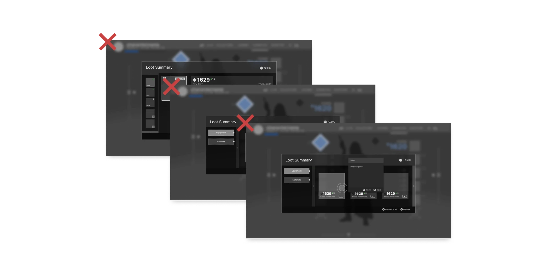
During this period, I discovered one of the original concepts I had, a Loot Summary window that would appear when receiving large quantities of loot would create an annoying, duplicative experience when overlaying with the Vendor rewards UI.
I felt the Vendor rewards UI would be both more value and a lower overall tech burden, since it already has a UI to work within, so I axed the entirety of this solution.


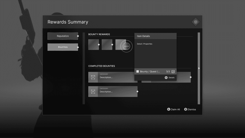
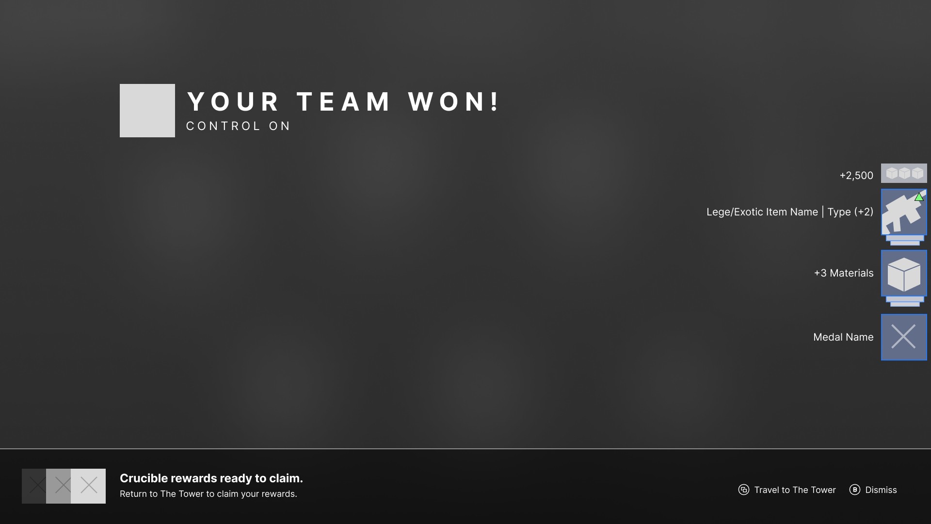
New Post-Activity UI
Preview of what's available back at the vendor (ie, rank rewards, cosmetics, quest rewards, etc).
Stacking rewards feed
Items grouped by like-objects (weapons on weapons, materials on materials, etc)
Stacked based on rarity and power difference from equipped.
Exotics on top, commons on bottom
A counter of how many (3 weapons, 3 materials, etc.)
Room for additional rewards counters
Shaders, icons, catalysts, etc.
Shortcut directly to Tower, skipping Director and Orbit.
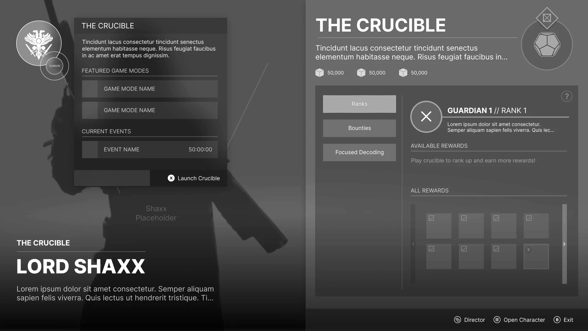
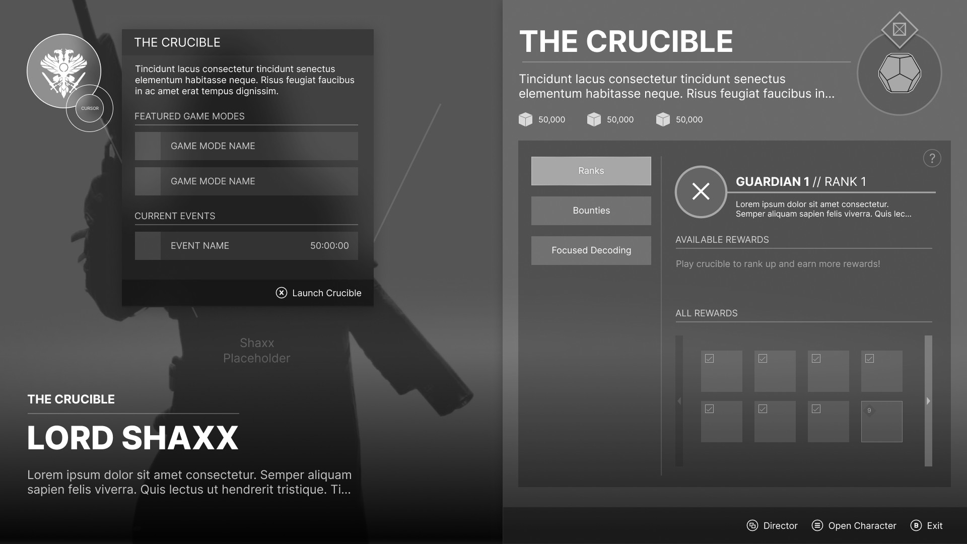
Updated Vendor Screen
Hovering over Crucible icon yields Featured Game modes and their respective duration
A shortcut to open Crucible directly, skipping Director and Orbit.
Re-organized vendor experience to focus on rewards, as well as how to get them, to improve the new player experience.
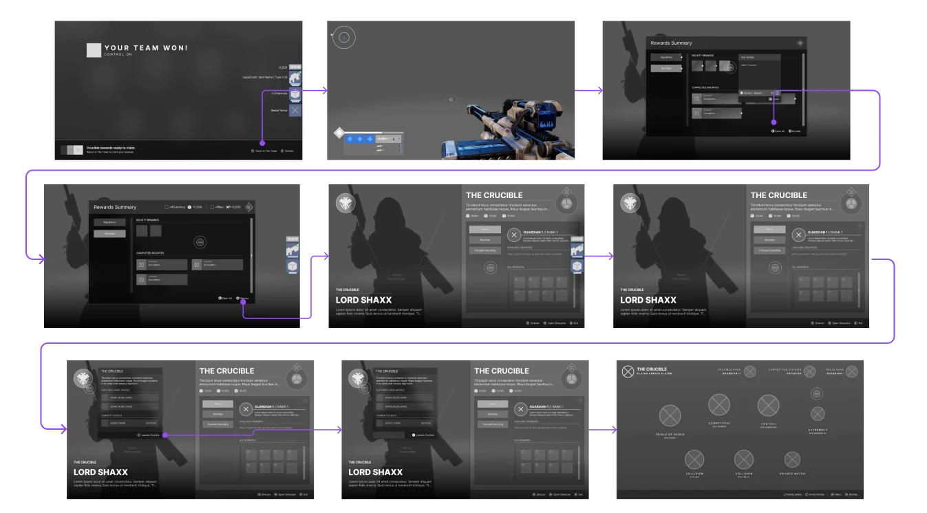
Finalized Wireflow
Once I was happy with the task flow and it makes sense with the total system map we made earlier (minus some suggest updates where it makes sense), I created a user flow, capturing the pieces of the experience that a player would touch on their way to achieve a goal (choices included!).
Wireframing

Trial and Error
Throughout the process, I am stopping and testing the design to see if it improves the current experience, and see if there's any obvious usability challenges with the new version.
During this period, I discovered one of the original concepts I had, a Loot Summary window that would appear when receiving large quantities of loot would create an annoying, duplicative experience when overlaying with the Vendor rewards UI.
I felt the Vendor rewards UI would be both more value and a lower overall tech burden, since it already has a UI to work within, so I axed the entirety of this solution.

New Post-Activity UI
Preview of what's available back at the vendor (ie, rank rewards, cosmetics, quest rewards, etc).
Stacking rewards feed
Items grouped by like-objects (weapons on weapons, materials on materials, etc)
Stacked based on rarity and power difference from equipped.
Exotics on top, commons on bottom
A counter of how many (3 weapons, 3 materials, etc.)
Room for additional rewards counters
Shaders, icons, catalysts, etc.
Shortcut directly to Tower, skipping Director and Orbit.

Updated Vendor Screen
Hovering over Crucible icon yields Featured Game modes and their respective duration
A shortcut to open Crucible directly, skipping Director and Orbit.
Re-organized vendor experience to focus on rewards, as well as how to get them, to improve the new player experience.

Finalized Wireflow
Once I was happy with the task flow and it makes sense with the total system map we made earlier (minus some suggest updates where it makes sense), I created a user flow, capturing the pieces of the experience that a player would touch on their way to achieve a goal (choices included!).
Outcomes and Next Steps
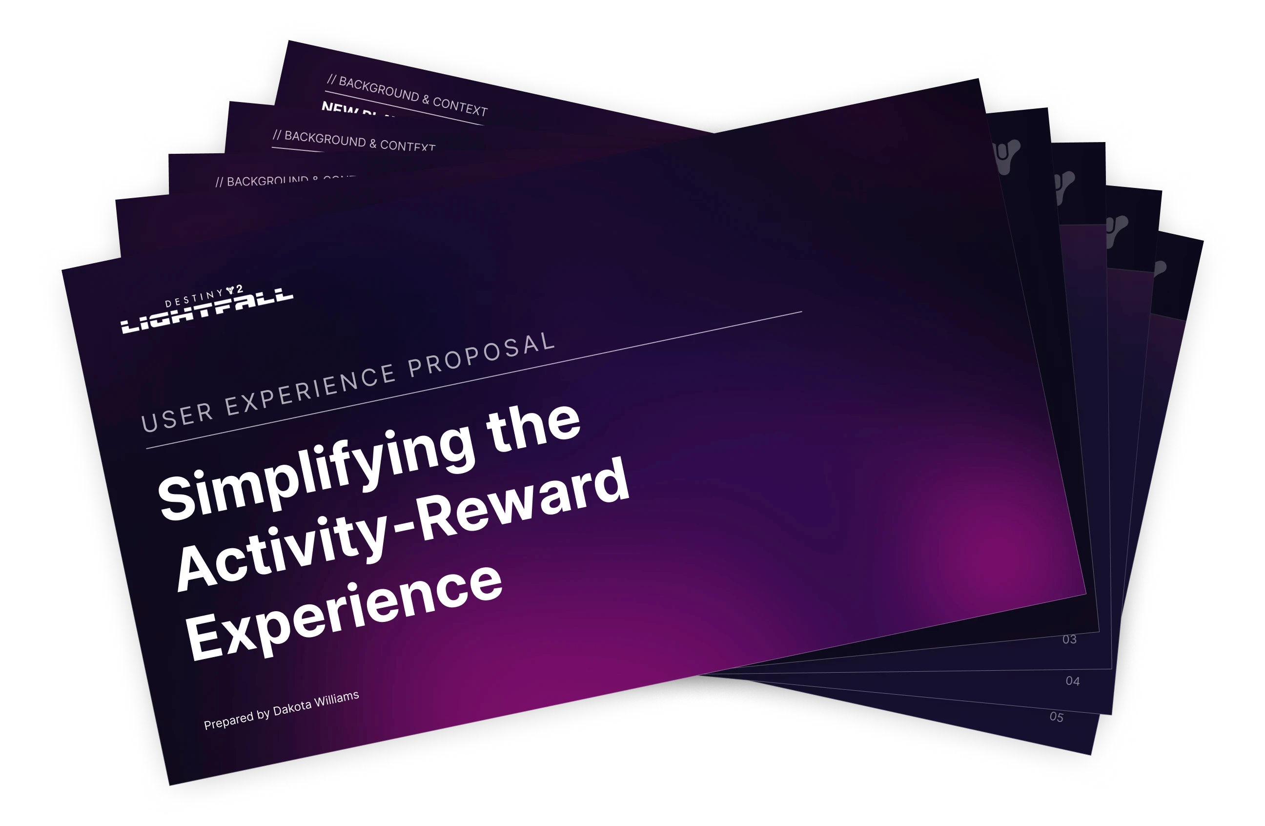

Final Presentation
As part of this coursework, I created a full presentation that would be presented to stakeholders. Feel free to take a look!
View Full Presentation
Next Steps
I got some excellent feedback that I'd like to roll into some updates coming later. Namely, I want to ensure the wireframes are striking the right balance between what's available today and what we could do tomorrow. I'm going to go over more of the design system and implement tighter adherence to that, as well as move into high fidelity later on.
Thanks for reading!
Outcomes and Next Steps

Final Presentation
As part of this coursework, I created a full presentation that would be presented to stakeholders. Feel free to take a look!
View Full Presentation
Next Steps
I got some excellent feedback that I'd like to roll into some updates coming later. Namely, I want to ensure the wireframes are striking the right balance between what's available today and what we could do tomorrow. I'm going to go over more of the design system and implement tighter adherence to that, as well as move into high fidelity later on.
